14 Coffee Bean Logo Designs
A great logo is the foundation of any strong coffee brand. Whether you’re launching a café, building an online coffee business, or creating a personal coffee blog, your logo is often the first thing people notice. And when it comes to coffee branding, few elements are as powerful and versatile as the humble coffee bean.
In this guide, we’ll explore 14 coffee bean logo design ideas, breaking down how each style looks, what message it conveys, and when you might want to use it. These ideas can inspire you whether you’re designing from scratch or refining an existing concept.
1. Minimalist Single Coffee Bean Logo
A minimalist coffee bean logo focuses on simplicity. It usually features a single, cleanly drawn coffee bean with smooth lines and minimal detail.
How it looks:
- A simple oval-shaped bean
- A single curved line dividing the bean
- Monochrome color (often black or brown)
- No shadows or textures
Why it works:
Minimalist designs are timeless and highly versatile. They look great on packaging, social media, and even as tiny app icons. This style communicates clarity, elegance, and modern branding.
2. Coffee Bean with Steam Design
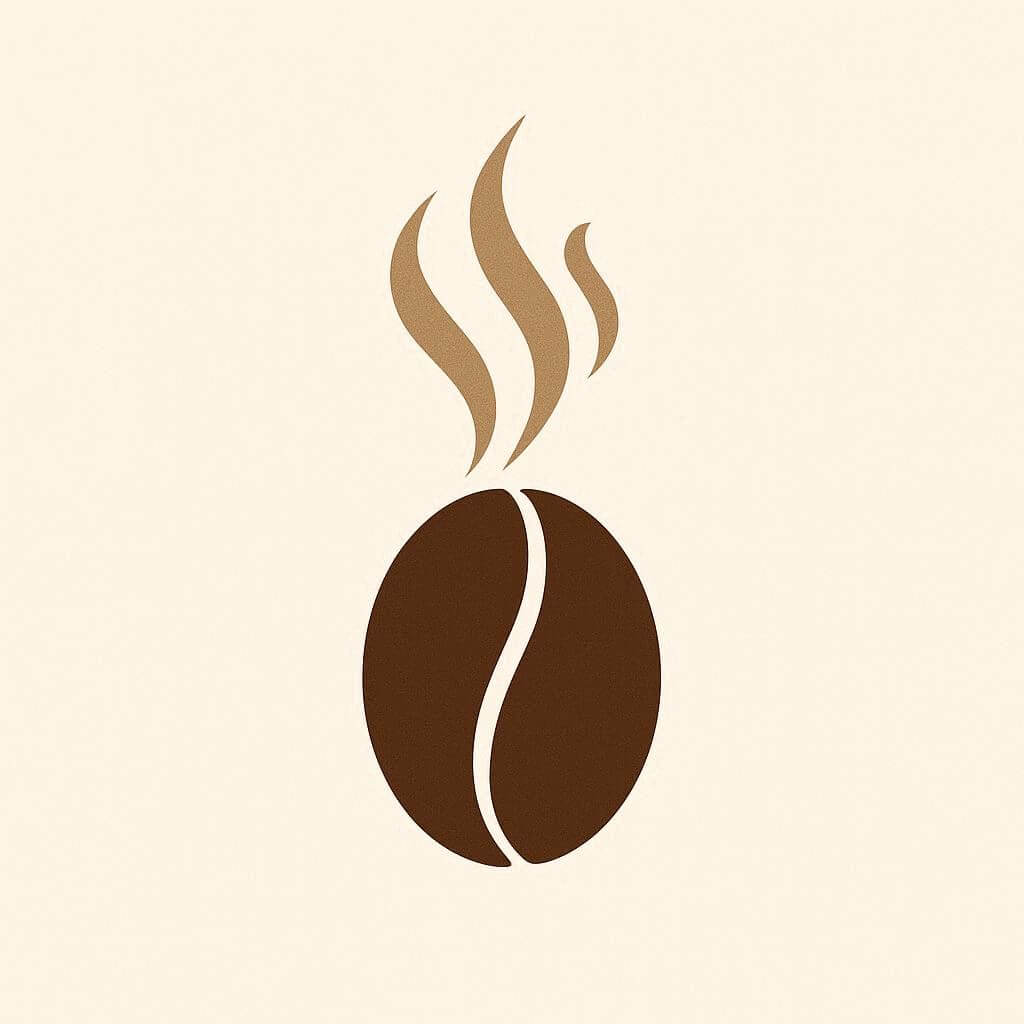
This logo combines a coffee bean with rising steam lines to symbolize a freshly brewed cup.
How it looks:
- A coffee bean at the center
- Stylized steam lines rising above it
- Sometimes the steam forms a cup shape
Why it works:
It instantly communicates warmth and freshness. This design is perfect for cafés or brands that emphasize freshly brewed coffee.
3. Coffee Bean in a Cup Shape

This clever design arranges coffee beans to form the shape of a coffee cup.
How it looks:
- Multiple beans arranged in a cup silhouette
- Often includes a handle shape
- Can be enclosed in a circle or badge
Why it works:
It’s creative and symbolic. It combines both the product (beans) and the experience (coffee drinking) in one design.
4. Vintage Coffee Bean Badge Logo
Vintage-style logos are very popular in coffee branding, especially for artisanal or specialty coffee brands.
How it looks:
- Coffee beans inside a circular badge
- Decorative elements like ribbons, stars, or borders
- Serif or script typography
- Earthy color palette
Why it works:
It evokes tradition, craftsmanship, and authenticity. This style is perfect for brands that want to highlight quality and heritage.
5. Coffee Bean with Leaf Element
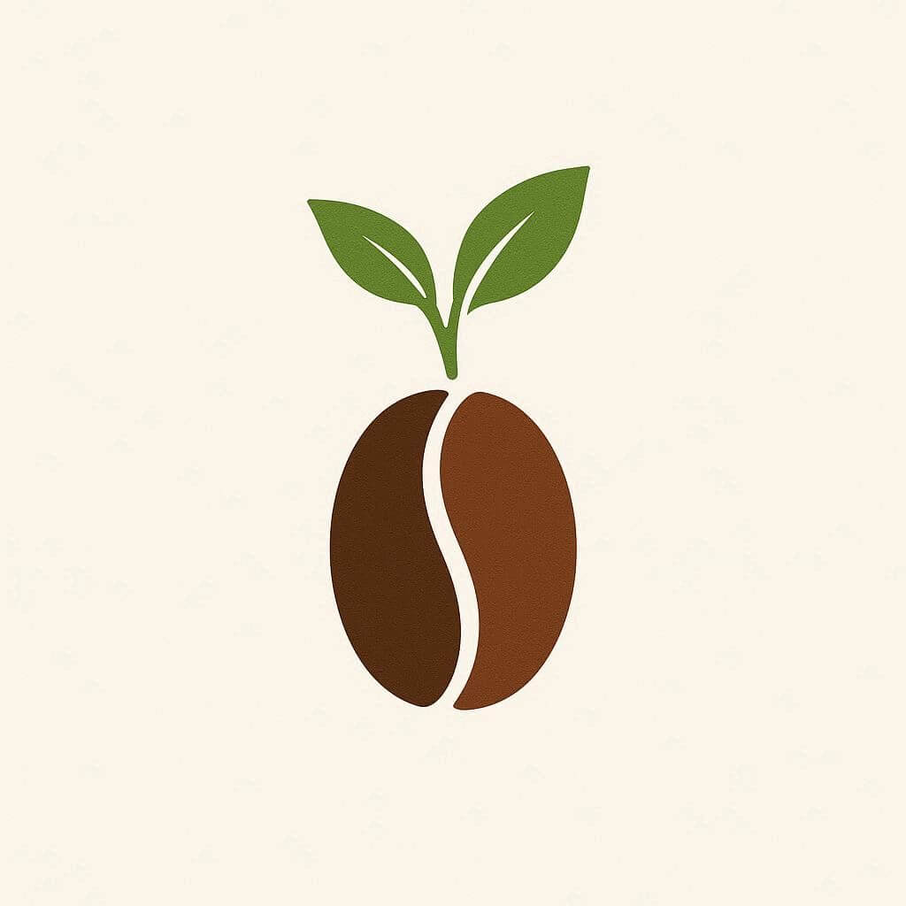
Adding a leaf to your coffee bean design creates a natural, organic feel.
How it looks:
- A coffee bean with a leaf sprouting from it
- Green accents
- Sometimes combined with eco-friendly symbols
Why it works:
This design is ideal for organic, fair-trade, or eco-conscious coffee brands. It communicates sustainability and natural sourcing.
6. Coffee Bean with Monogram Letters
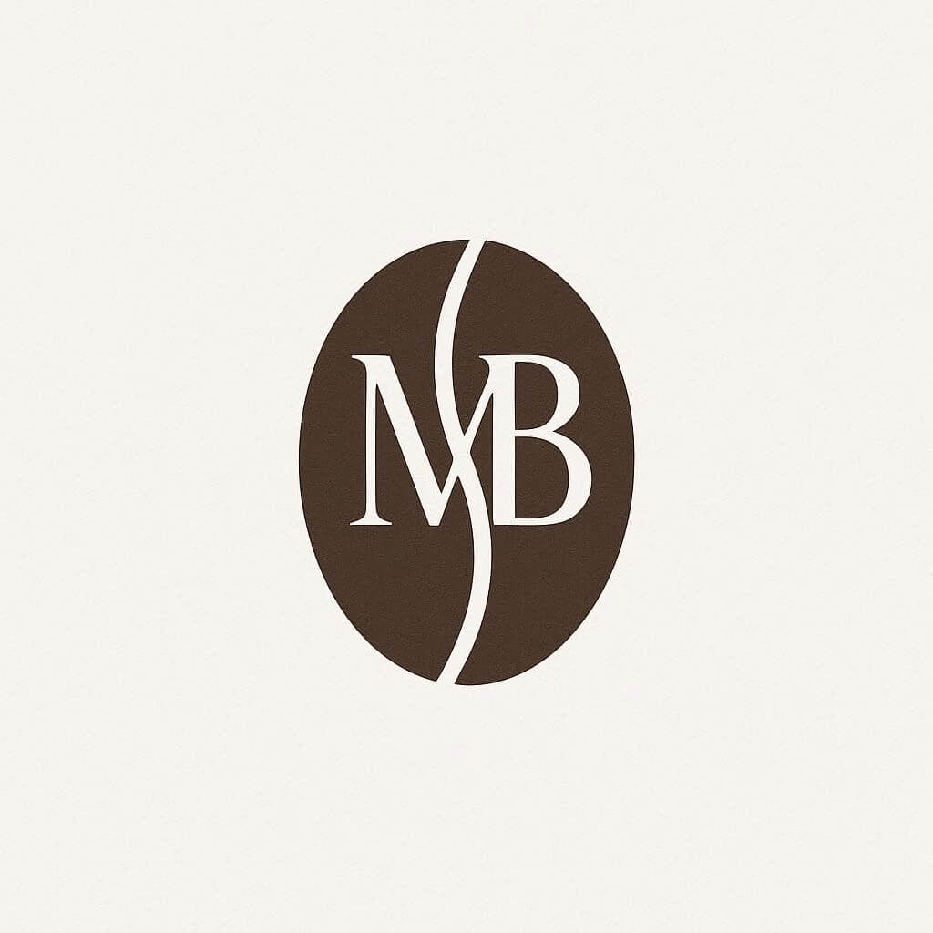
This design combines coffee beans with initials or a monogram.
How it looks:
- Letters (like “CB” or brand initials) integrated with bean shapes
- The bean may form part of the letter
- Clean, modern typography
Why it works:
It creates a personalized and professional look. It’s great for branding consistency and brand recognition.
7. Coffee Bean in a Circle Emblem

Circular logos are very popular because they are balanced and visually pleasing.
How it looks:
- Coffee bean placed in the center of a circle
- Surrounding text around the edge
- Symmetrical and balanced layout
Why it works:
This design is highly versatile and works well for packaging, stamps, and stickers. It gives a structured and professional impression.
8. Abstract Coffee Bean Logo
Abstract designs take a more artistic approach to the coffee bean.
How it looks:
- Geometric shapes forming a bean
- Artistic lines and curves
- Sometimes almost unrecognizable as a bean at first glance
Why it works:
This style is perfect for modern brands that want to stand out and appear innovative. It creates intrigue and uniqueness.
9. Coffee Bean with Coffee Cup Steam Art
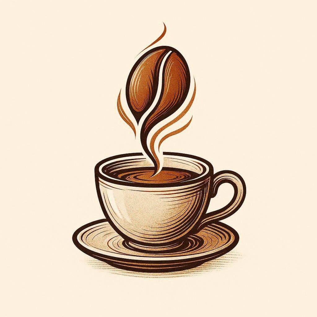
This is a more detailed and artistic version of the steam logo.
How it looks:
- Steam rising from a cup
- Steam transforms into a coffee bean shape
- Often includes intricate line work
Why it works:
It’s creative and visually engaging. It tells a story about the journey from bean to cup.
10. Dark Roast Coffee Bean Logo
A darker, richer style inspired by dark roasted coffee beans.
How it looks:
- Deep brown or black color palette
- Slight texture to simulate roasted beans
- Strong contrast and bold typography
Why it works:
This style communicates strength, bold flavor, and intensity — perfect for espresso brands or strong coffee blends.
11. Hand-Drawn Coffee Bean Logo
Hand-drawn logos feel personal and artistic.
How it looks:
- Sketch-style coffee beans
- Imperfect lines for a handmade feel
- Brush or pen-like textures
Why it works:
It adds authenticity and personality. Ideal for artisanal coffee brands or small businesses that want a human touch.
12. Coffee Bean with Mountain or Landscape
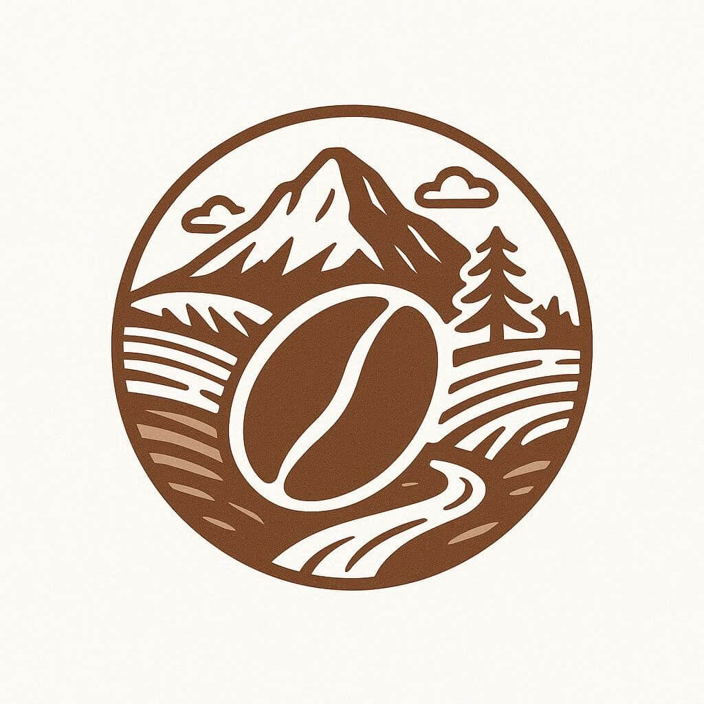
This design combines coffee beans with natural landscapes.
How it looks:
- Coffee bean integrated with mountains, trees, or hills
- Often used in circular layouts
- Earth tones and nature-inspired colors
Why it works:
It emphasizes the origin of coffee — especially for brands highlighting single-origin beans or mountain-grown coffee.
13. Coffee Bean in Negative Space Design
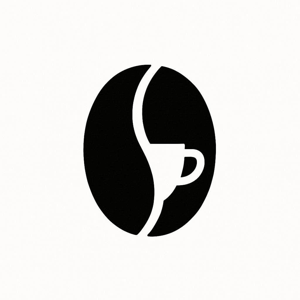
Negative space logos use hidden shapes within the design.
How it looks:
- Coffee bean shape formed using negative space
- Hidden cup or leaf inside the bean
- Clean and clever composition
Why it works:
It’s visually clever and memorable. These designs often create a “wow” effect when people notice the hidden element.
14. Typographic Coffee Bean Logo
In this design, typography takes center stage, with subtle coffee bean elements included.
How it looks:
- Bold brand name as the main focus
- Coffee bean used as a dot or letter element
- Clean, typography-driven layout
Why it works:
It’s simple yet highly effective. This style is perfect for brands that want to emphasize their name and keep the design clean and modern.
How to Choose the Right Coffee Bean Logo Design
Choosing the right coffee bean logo design is more than just picking something that looks good. Your logo should reflect your brand’s identity, connect with your audience, and work across all the places your brand appears. Here are the key factors to consider.
Brand personality
Start by defining your brand’s personality. Are you aiming for a sleek and modern look, a cozy and vintage café vibe, or something playful and creative?
- Modern brands often use clean lines, minimal shapes, and simple color palettes.
- Vintage styles rely on badges, textures, and classic typography.
- Playful brands may include hand-drawn elements or quirky compositions.
- Premium brands typically use elegant fonts, refined layouts, and minimalistic design.
Your coffee bean logo should visually communicate this personality at a glance.
Target audience
Think about who you’re trying to attract. Your logo should appeal directly to your ideal customer.
- If your audience is casual coffee drinkers, a warm, friendly, and approachable design works best.
- For specialty coffee enthusiasts, a more refined, minimalist, or origin-focused design may feel more authentic.
- A younger audience might respond better to bold, trendy, or abstract styles.
- A luxury-focused audience expects sophistication and subtle elegance.
The more your logo resonates with your audience, the stronger your brand connection will be.
Usage and versatility
Your logo needs to look great everywhere — not just on your website.
Consider where it will appear:
- Coffee cups and packaging
- Social media profiles
- Website headers
- Merchandise like mugs or tote bags
A good coffee bean logo should be:
- Scalable (looks good both small and large)
- Readable even at small sizes
- Adaptable to different formats (square, horizontal, vertical)
Simple, well-balanced designs usually perform best across all platforms.
Simplicity and memorability
When it comes to logos, less is often more. A simple design is easier to recognize, remember, and reproduce.
Avoid:
- Too many details
- Overly complex illustrations
- Cluttered layouts
Instead, aim for:
- Clean shapes
- Clear structure
- Strong visual focus
Think of iconic logos — they’re often incredibly simple, yet instantly recognizable.
Color palette
Color plays a huge role in how your brand is perceived. Coffee brands naturally lean toward warm, earthy tones, but you can still get creative within that space.
Popular choices include:
- Brown (coffee, warmth, reliability)
- Cream/beige (softness, comfort)
- Black (premium, bold, modern)
- Green (organic, sustainable coffee)
Make sure your colors:
- Work well together
- Look good in both color and black-and-white
- Match your overall brand mood
Typography (often overlooked, but crucial)
If your logo includes text, the font you choose matters just as much as the icon.
- Serif fonts feel more traditional and refined
- Sans-serif fonts feel modern and clean
- Script fonts add elegance or a handcrafted touch
Your typography should complement your coffee bean design — not compete with it.
Uniqueness and brand differentiation
The coffee industry is highly competitive, so your logo needs to stand out.
Ask yourself:
- Does this look like every other coffee logo?
- Is there a unique twist or concept?
- Would someone recognize this after seeing it once or twice?
Even a small creative detail — like negative space or an unexpected shape — can make a big difference.
Summary
Coffee bean logos are incredibly versatile and timeless. Whether you prefer minimalist, vintage, or highly creative designs, there’s a coffee bean logo style that can perfectly represent your brand.
By exploring these 14 coffee bean logo designs, you now have a solid foundation of inspiration to create a logo that is not only visually appealing but also meaningful and memorable. If you’re looking for even more creative directions, you might also enjoy our guide on 12 Coffee Logo Ideas Featuring a Heart Shape, which explores a softer, more emotional approach to coffee branding.
If you’re building a coffee brand, your logo should tell a story — one that connects your audience to the aroma, warmth, and experience of coffee.