Latte Art Logo Ideas: The Ultimate Guide to Brewing a Brand That Sticks
If you’ve ever stood in front of a coffee shop and instantly recognized it by its logo before you even read the name, you already understand the power of visual branding in the coffee world. A latte art logo does more than decorate a cup or a storefront sign — it tells your customers, in a split second, what kind of experience they’re about to have. Warm and cozy? Bold and modern? Artisanal and slow-crafted? The right logo communicates all of that without a single word.
In this guide, we’ll walk through nine creative directions for a latte art logo, explain why latte art has become such a popular symbol in coffee branding, share practical tips for designing one that works across every platform, and highlight common mistakes that sink an otherwise great coffee shop logo. Whether you’re opening your first espresso bar or refreshing an existing brand, this article will give you a clear roadmap.
Why Latte Art Works So Well as a Logo Symbol
Latte art — the rosette, the heart, the tulip, the swirl — has become visual shorthand for quality coffee. When a customer sees that feathered leaf pattern or a delicate foam heart, their brain immediately associates it with craftsmanship, warmth, and a barista who cares about the details. This is exactly why so many brands lean on it for their coffee shop logo.
There’s also a psychological layer here. Coffee is an emotional product. People don’t just buy caffeine; they buy a ritual, a moment of pause, a small luxury in their day. A well-designed latte art logo taps into that emotional connection instantly. The curved, organic lines of foam art feel handmade and human, which contrasts beautifully with the fast-paced, digital world most of your customers are coming from.
From a marketing standpoint, latte art is also incredibly versatile. It works in monochrome, in color, as a small app icon, or blown up on a shop awning. That flexibility is a huge asset when you’re building a brand that needs to show up consistently across cups, napkins, social media, delivery apps, and merchandise.
Breaking Down Nine Latte Art Logo Concepts
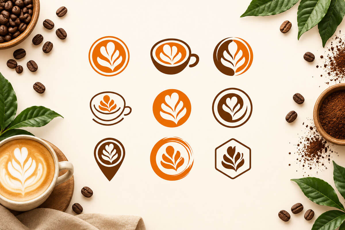
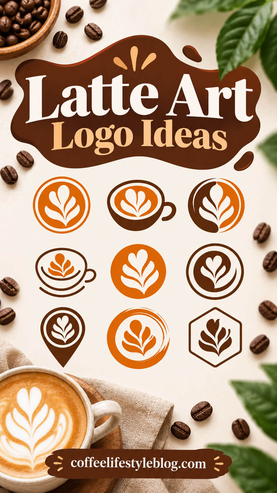
Let’s go through nine strong directions for a latte art logo, using the classic “leaf” or “rosette” pour as the central motif, since it’s one of the most recognizable and elegant patterns in the coffee world.
1. The Classic Circle Badge

A simple, bold circle containing a white latte art leaf on a rich orange or brown background is one of the safest and most effective choices for a coffee shop logo. This format works particularly well because circular badges are instantly recognizable at small sizes — think favicons, social media profile pictures, and coffee cup stickers. Simplicity is your biggest ally here. A clean silhouette reads clearly even from a distance, which matters enormously for storefront signage.
2. The Coffee Cup Silhouette
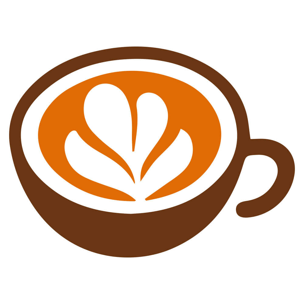
Placing the latte art pattern directly inside an illustrated cup and saucer (or a cup with a handle) makes the concept unmistakable. This approach is great for brands that want zero ambiguity about what they sell. It’s a literal, friendly design that feels approachable rather than abstract. The downside? It can feel a little more generic unless you add a unique color palette or a distinctive cup shape to stand out from competitors using the same idea.
3. The Split-Tone Circle

A logo split into two contrasting colors — say, half deep brown and half warm orange — with the latte art pattern layered on top creates visual tension and sophistication. This style suggests balance: the meeting of milk and espresso, light and dark, morning and energy. This concept photographs beautifully on merchandise like tote bags, mugs, and packaging because the contrast pops even in low-resolution printing.
4. The Minimal Line Cup

A thin-line illustration of a cup with a subtle, less detailed latte art pour (just a small heart or a simple rosette bud) creates an elegant, boutique feel. This is ideal for coffee shop logo designs aiming for a minimalist, Scandinavian-inspired, or “quiet luxury” aesthetic. Brands going for a calm, editorial vibe — think specialty roasters or slow-coffee concepts — tend to gravitate toward this style.
5. The Solid Circle Icon

A single-color filled circle with a crisp white latte art silhouette punched out of the center is one of the most scalable options in this whole list. Because it relies on negative space rather than fine detail, it remains legible even when shrunk down to the size of a favicon or an app icon. This is a smart pick for coffee shops planning to launch a loyalty app or heavy social media presence.
6. The Ringed Emblem

Adding a second color ring around the central latte art icon (like a brown circle inside a lighter outer ring) gives the logo a stamped, seal-like quality. This design choice evokes tradition and authenticity — similar to coffee bean sacks or vintage roastery labels. It’s a strong option for brands that want to lean into heritage storytelling, even if the shop itself is brand new.
7. The Location Pin Logo

Turning the latte art icon into a map pin shape is a clever, dual-purpose idea. It works as a coffee shop logo on your signage and packaging, but it also doubles brilliantly as a map marker for Google Maps listings, delivery apps, and “find us” pages on your website. This is a smart, function-first design choice for shops that rely heavily on local search and foot traffic.
8. The Brushstroke Circle

Wrapping the latte art icon in a loose, hand-painted brushstroke ring adds energy and an artisanal, imperfect charm. This style suggests craftsmanship and a personal touch — like the logo itself was painted by hand rather than generated by a machine. It pairs well with rustic interior design, exposed brick, reclaimed wood counters, and other “small-batch” branding cues.
9. The Hexagon Emblem

A latte art icon placed inside a hexagon or geometric badge shape feels modern, structured, and a little more premium. Hexagons aren’t as commonly used as circles in coffee branding, which means this shape choice alone can help you stand out in a crowded market of round coffee logos. It works particularly well for brands with a more industrial, tech-forward, or design-conscious identity.
What Makes a Latte Art Logo Actually Work
Looking at all nine directions above, a few shared principles emerge. If you’re designing (or commissioning) your own latte art logo, keep these in mind:
Silhouette clarity matters more than detail. The best latte art logos boil the pour pattern down to its essential shape — a leaf, a heart, a rosette — rather than trying to replicate photorealistic foam texture. A logo needs to be recognizable at a glance, whether it’s printed on a 2-inch cup sleeve or a 20-foot storefront sign.
Color psychology plays a real role. Warm oranges and browns dominate coffee branding for a reason — they evoke roasted beans, warmth, and comfort. But don’t be afraid to break convention if your brand identity calls for it. A deep forest green or a moody charcoal palette can help a coffee shop logo stand apart from the sea of orange-and-brown competitors.
Scalability is non-negotiable. Your logo needs to work as a tiny app icon, a website favicon, an embroidered patch on an apron, and a massive printed banner. Test every logo concept at multiple sizes before finalizing it. If details disappear or the shape turns into a blob at small sizes, it needs simplifying.
Versatility across formats extends your logo’s lifespan. A strong latte art logo should look just as good in black and white as it does in full color, since you’ll inevitably need a single-color version for stamps, embossing, or low-cost printing.
Common Mistakes to Avoid When Designing a Latte Art Logo
Even with a great concept, execution can go wrong. Here are the most frequent pitfalls:
Overcomplicating the foam pattern. Trying to depict an intricate, multi-layered rosette with dozens of tiny leaves might look impressive as a large illustration, but it becomes an unreadable smudge once shrunk down. Stick to a simplified, iconic version of the pour.
Choosing a font that clashes with the icon’s tone. A delicate, artisanal latte art icon paired with a harsh, industrial sans-serif font sends mixed signals. Make sure your typography matches the emotional tone of your imagery — soft and organic icons pair well with rounded or script-style fonts, while geometric icons (like the hexagon badge) pair better with clean, modern sans-serifs.
Relying too heavily on trendy colors. Millennial pink, neon gradients, and other short-lived color trends might feel fresh today but can date your coffee shop logo within a couple of years. Anchor your palette in colors with staying power, and use trend colors only as small accents if at all.
Ignoring how the logo performs in real-world applications. A logo that looks stunning on a computer screen can fall apart when embroidered on an apron, engraved on a wooden sign, or printed on a paper cup with limited color options. Always mock up your logo in real contexts — cups, signage, social media avatars — before committing.
Copying a competitor’s concept too closely. Latte art is a popular motif, which means there’s a real risk of your logo looking like ten other shops in town. Differentiate through color choice, shape framing (circle vs. hexagon vs. pin), line weight, or a unique compositional twist.
Skipping trademark research. Before falling in love with a design, do a basic search to make sure a similar logo isn’t already trademarked in your region or industry. This simple step can save you a costly rebrand down the line.
Where to Get Your Latte Art Logo Designed
Once you’ve settled on a direction — whether it’s the bold circle badge, the split-tone emblem, or the clever location-pin concept — the next step is bringing it to life professionally. Many coffee shop owners start by sketching rough ideas themselves, then hand them off to a designer to refine the linework, balance the composition, and prepare production-ready files (vector formats, color variations, and size-specific versions).
If you don’t have an in-house designer, freelance marketplaces like Fiverr and Upwork are popular starting points, since you can browse portfolios specifically filtered for logo design and coffee branding work. For a more curated, contest-style approach, platforms like 99designs let multiple designers submit concepts based on your brief, which can be useful if you want to compare several visual directions for your coffee shop logo before committing. If your budget allows for something more bespoke, searching Dribbble or Behance for “coffee branding” or “latte art logo” portfolios is a great way to find designers whose personal style already aligns with the aesthetic you’re after — then reach out directly. Local design schools and branding studios are also worth considering if you want ongoing support beyond just the logo, such as menu design, packaging, and signage that all work together cohesively.
Final Thoughts
A great latte art logo does more than look pretty on a cup — it becomes the visual anchor of your entire brand, showing up on your storefront, your website, your delivery packaging, and every piece of marketing you create. The nine concepts covered here — from the classic circle badge to the modern hexagon emblem — each offer a different personality, so the right choice really comes down to the feeling you want your coffee shop logo to evoke: cozy and traditional, sleek and modern, or artisanal and hand-crafted.
Whatever direction you choose, prioritize clarity, scalability, and a distinct point of view. A logo built on those fundamentals won’t just look good on opening day — it’ll still be working hard for your brand years down the road.

